# Week 10: Platform specifications

Learning Objective
By the end of this week, students will:
- Understand the implications of hardware and devices on UI design
- Know where to find, how to use mobile platform guidelines and UI assets
- Compare guidelines across various platforms especially iOS and Android
- Understand input on mobile devices
- Know common mobile controls, components, input methods, and when to use them
# Impact of devices and hardware on user behaviour?
Designing user interfaces for different devices involves addressing various challenges and considerations that impact the overall user experience. Here are some key factors to consider:
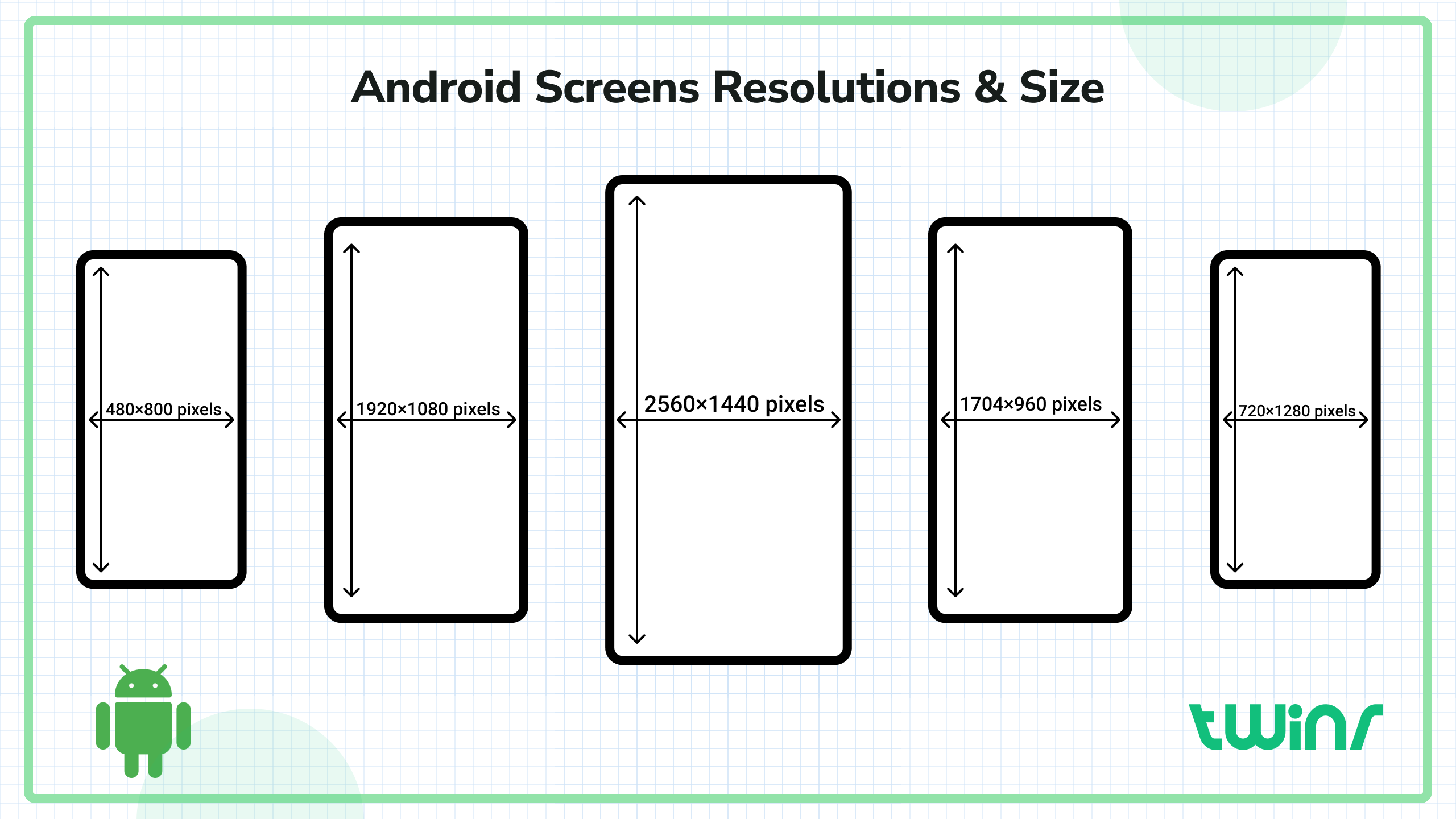
# 1. Screen Size and Resolution
- Desktop: Larger screens with higher resolution allow for more detailed and complex interfaces. There’s room for multiple columns, detailed navigation menus, and extensive content.
- Tablet: Medium-sized screens require a balance between desktop and mobile design principles. UI elements may need to be larger than on desktops but can still support complex interactions.
- Mobile: Smaller screens necessitate simplified interfaces with larger touch targets. Prioritizing content and reducing clutter are crucial for usability.
# 2. Input Methods
- Mouse and Keyboard (Desktop): Precise pointing and extensive input options allow for smaller touch targets and keyboard shortcuts.
- Touch (Mobile/Tablet): Requires larger touch targets and gestures (swipe, pinch, etc.). Touch interfaces also need to account for finger reach and ergonomics.
- Voice (Smart Speakers, Mobile): Voice interactions demand clear and concise prompts, ensuring the system can understand various accents and speech patterns.
- Stylus (Tablets): Some tablets support stylus input, which can be more precise but still requires consideration of hand positioning and palm rejection.

# 3. Context of Use
- Desktop: Often used in stable environments (like offices) with prolonged interaction periods. Interfaces can afford to be more complex.
- Mobile: Frequently used on the go, requiring quick, easy interactions. Interfaces should support short, intermittent use and be operable with one hand.
- Tablet: Used both on the go and in stable environments. Often used for consuming media, reading, or light productivity tasks, needing a balance of complexity and simplicity.
# 4. Performance and Connectivity
- Desktop: Typically has more powerful hardware and stable internet connections. Interfaces can include more resource-intensive elements like high-resolution images and videos.
- Mobile/Tablet: Devices might have limited processing power and varying connectivity. UI designs should be optimized for performance, with lightweight assets and offline functionality where possible.
# 5. Orientation and Layout
- Desktop: Fixed landscape orientation allows for complex layouts with multiple columns and detailed navigation.
- Mobile/Tablet: Must account for both portrait and landscape orientations. Responsive design is essential to adapt layouts dynamically based on orientation and screen size.
# 6. Accessibility
- Desktop: Leverage keyboard navigation, screen readers, and other assistive technologies. Ensure all interactive elements are accessible via keyboard.
- Mobile/Tablet: Support screen readers (like VoiceOver for iOS and TalkBack for Android), and ensure all touch targets are large enough and labeled appropriately for accessibility.
# 7. Battery Life and Resource Management
- Mobile/Tablet: Design with battery efficiency in mind. Avoid using battery-intensive features excessively, such as continuous location tracking or frequent background processes.
# 9. User Expectations
- Desktop: Users expect robust functionality and multitasking capabilities. Design for multi-window interactions and rich feature sets.
- Mobile/Tablet: Users prioritize convenience and speed. Focus on core features and streamline workflows for quick task completion.
# Platform Guidelines
Platform guidelines are a set of design principles, best practices, and rules provided by various platforms (like iOS, Android, and web platforms) to ensure consistency, usability, and a good user experience across applications.
# 1. Understanding the Platform’s Human Interface Guidelines (HIG)
- iOS: Apple's Human Interface Guidelines (HIG) provide comprehensive instructions on designing for iOS. It covers aspects like touch interactions, navigation, and visual design principles.
- Android: Google’s Material Design Guidelines provide extensive information on designing for Android, including details on material theming, motion, interaction, and visual design.
- Web: Web design guidelines can vary, but resources like Google’s Material Design for the web and responsive web design principles are crucial.
# 2. Navigation Patterns
- Consistency: Ensure navigation is intuitive and consistent. Use standard navigation patterns like tab bars for iOS and bottom navigation for Android.
- Hierarchy: Organize content logically and hierarchically, making it easy for users to find what they need.
# 3. Visual Design
- Typography: Follow platform-specific typography guidelines. iOS typically uses San Francisco, while Android uses Roboto.
- Color: Use platform-specific color schemes and ensure sufficient contrast for readability and accessibility.
- Icons and Imagery: Utilize platform-specific iconography and image styles. Ensure icons are clear, recognizable, and consistent.
# 4. Touch Interactions
- Tap Targets: Ensure tap targets are large enough (at least 44x44 points for iOS and 48x48 dp for Android).
- Gestures: Implement standard gestures like swiping, pinching, and dragging as per platform norms.
# 5. Motion and Animation
- Purposeful Motion: Use animations to enhance user experience, not distract. Follow guidelines for motion to ensure they are smooth and meaningful.
- Feedback: Provide feedback for user interactions, such as button presses, to enhance the sense of control and responsiveness.
# 6. Platform-Specific Components
- iOS: Familiarize with components like Navigation Bars, Tab Bars, Modals, and Collection Views.
- Android: Learn about components like App Bars, Floating Action Buttons (FABs), Bottom Navigation, and RecyclerViews.
# 7. Documentation and Resources
- Stay Updated: Platforms regularly update their guidelines. Stay current with the latest updates and best practices.
- Official Resources: Utilize official documentation and resources for in-depth understanding and examples.
# Resources:
- Apple Human Interface Guidelines: Apple HIG (opens new window)
- Google Material Design Guidelines: Material Design (opens new window)
- Figma UI Kits: Add the platforms UI kits in Figma to any file you want to use by searching for them in the asset library and adding them. Here is a link to the latest Apple and Material UI kits currently available.
- IOS 18 Figma UI Kit (opens new window)
- Material 3 UI Kit (opens new window)
By following these platform guidelines, designers can create applications that are not only visually appealing but also provide a seamless and intuitive user experience.
# Lesson Slides
# Read
- Textbook: Mobile Design Pattern Gallery - Chapter 2, Forms (pages 39-61) (opens new window)
- DROP-DOWNS, RADIO BUTTONS, CHECKBOXES… OH MY! (opens new window)
# Additional Resources
- Form design cheat sheet::v1-Form-design-crib-sheet.pdf
- UI Control Guidelines by Balsamiq (opens new window)