# Week 4: Typography & Visual assets

# What is Typography in UI Design?
Typography refers to the style, arrangement, and appearance of text in a design. It includes font-family, font-size, line-spacing, line-height... Effective typography improves readability, communicates hierarchy, tone, brand and personality of a product. Typography also plays an important role in the aesthetics of the interface and enhances visual appeal of a product.
# Typefaces and Fonts: what is the difference?
A typeface refers to the design of the letters, numbers, and symbols that make up a particular set of characters. Typeface = Design: It's the specific look and feel of the characters. Example: Helvetica, a typeface designed with clean, modern lines.
A font refers to a specific style and size of a typeface. In digital typography, a font is a computer file that contains the typeface, including its size, weight, and style (e.g., bold, italic). Font = Typeface + Style + Size: It's the implementation of a typeface in a specific weight, size, and style. Example: Helvetica Bold 12pt is a font, as it specifies the typeface (Helvetica), the weight (Bold), and the size (12 points).

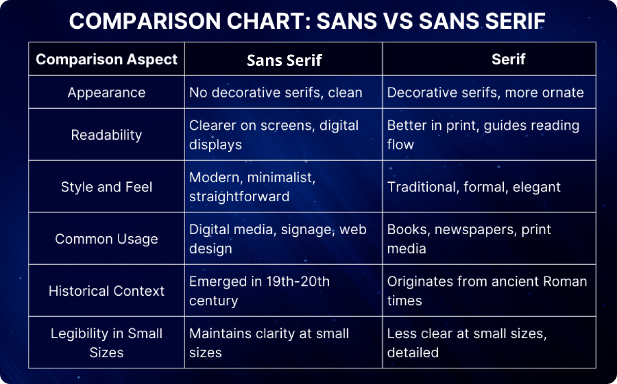
Serif Typefaces have small lines or strokes regularly attached to the ends of the larger strokes in a letter or symbol. These lines are called "serifs." Examples: Georgia, Garamond, Times New Roman.
Sans-Serif Typefaces lack the small lines or strokes at the ends of characters. "Sans" is French for "without," so sans-serif literally means "without serifs." Examples: Arial, Helvetica, Roboto.
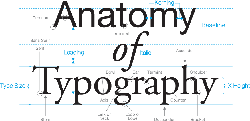
# Anatomy of Type
There are so many in-depth aspects to the anatomy of typography that go beyond the scope of this class. The article below is an excellent guide for you to get a basic understanding.
A visual guide to the anatomy of Typography (opens new window)
# Choosing and pairing the Right Typefaces
Choosing and combining typefaces is a critical skill for UI Design. Here are some guidelines and practical steps to help you pair typefaces:
- Define the Hierarchy: Determine which text elements need differentiation (e.g., headings, subheadings, body text, captions).
- Select Primary & secondary Typeface: Choose a versatile typeface for the primary role (e.g., headings) that fits the project's tone then choose a complementary typeface for body text that contrasts yet harmonizes with the primary typeface.
- Use a font pairing generator (tools & resources) to help you mock the test and find a combination suitable for your products.
# Hierarchy and Scale
A type scale is a predefined set of font sizes that are proportionally related. It’s like a musical scale, where each note has a specific relationship to the others, creating a sense of harmony. A type scale has a base font and scale ratio. The ratio determines how each successive size in the scale relates to the previous size. Common ratios include:
- Minor Third (1.2)
- Major Third (1.25)
- Perfect Fourth (1.333)
- Golden Ratio (1.618)
To create a Typography system for your project, it is important to understand scales and how they create a hierarchy for your product. The type scale website is a great asset to generate and understand typography scales. Type Scale (opens new window)
# Understanding the basics: type scale, line height, typography styles.
# Get super advanced and use Figma variables (released April 2024)
# Visual assets: Images, Icons & Illustrations
Visual assets play a crucial role in making interfaces visually appealing and emotionally engaging for users. Visual Assets include:
# Images:
including Hero, thumbnails, background and product images.
# Best Practices:
- Use high-quality, relevant images that align with the content and brand.
- Consider image aspect ratio when placing it in a component. Plugins can be used to ensure proper image aspect ration. Common ratios include: 4:3, 16:9, 5:4...
- Optimize for fast loading times.
- Ensure text overlay (if any) is readable.
- Maintain a consistent size and aspect ratio.
# Icons and Illustrations:
Visual elements that represent actions, features, or concepts.
# Best Practices:
- Maintain a consistent style throughout the interface.
- Use icons to simplify navigation and enhance usability.
- Employ illustrations to explain complex concepts or add a unique touch.
# Infographics and Data Visualization:
Visual representations of data to make complex information easy to understand.
# Best Practices:
- Use clear labels and legends.
- Choose the right type of visualization for the data (e.g., bar charts, pie charts).
- Avoid clutter and focus on key data points.
# Tips for Effectively Using Visual Assets
- Brand Identity & Consistency: Choose visual assets that align with the brand’s identity and personality. Maintain a consistent style throughout the interface to create a cohesive user experience.
- Accessibility: Ensure all visual assets meet accessibility standards. Use high-contrast colours, provide alternative text for images, and ensure interactive elements are easily accessible to all users.
- Optimisation: Optimize all visual assets for performance. Compress images and icons to reduce file sizes without sacrificing quality. Use vector graphics where possible for scalability.
# Using images in Figma
# Create an icon Library
# Using plugins for images and more
Top 10 Figma plugins (opens new window)
# Data visulization in Figma
# Tools & Resources
# Typography
- Serif vs. Sans Serif Fonts: When and How to Use Them (opens new window)
- The ultimate guide to font pairing (opens new window)
- Dyslexia font (opens new window)
# Iconagraphy
- Icon usability (opens new window)
- 7 principles of icon design all UI Designers should follow (opens new window)
# Data Visualization
- Material Design Data Visualization (opens new window)
- Data Visualisation for UX/UI Design (opens new window)
# Font Pairing generators
# CSS recommendations
CSS fallback fonts (opens new window)