# Week 9: Information Architecture - Navigation

Learning Objective
By the end of this week, students will:
- Understand Information architecture and its importance in designing a user interface
- Understand navigation as a critical component for the user to know where they are and where they need to go
- Understand the different types of navigation for mobile and web
- Create a site map to organize information in a website or mobile app
- Choose optimal navigation for different layers of an application
# Information Architecture Definition & Importance
Information Architecture is the practice of organizing and structuring content to help users find information and complete tasks. IA is a crucial aspect of both User Interface (UI) and User Experience (UX) design, as it directly impacts how users interact with a website, application. Good IA improves usability, enhances user experience, supports business goals and facilitates scalability.
# Key Components of Information Architecture
# A-Organization systems:
How content is categorized and arranged. Common structures include:
- Hierarchical: Content is arranged in a tree-like structure with a clear parent-child relationship.
- Sequential: Content is organized in a specific order, such as steps in a process.
- Matrix: Content can be accessed through multiple pathways, allowing for a more flexible organization.
# B-Labeling Systems:
This refers to the naming conventions used for categories, navigation items, and content. Effective labeling helps users understand what each section contains and where to find what they need.
# C-Navigation Systems:
The methods by which users move through the content. This includes:
- Global Navigation: The primary means of navigating a site, usually found at the top of every page.
- Local Navigation: Navigation within a specific section of the site.
- Contextual Navigation: Links within the content that lead to related information.
- Search: A tool for users to find content by entering keywords or phrases.
# D-Search Systems:
How users can search for and locate specific information. A well-designed search system includes features like filters, sorting, and relevance ranking to enhance the user experience.
# Creating an Information Architecture
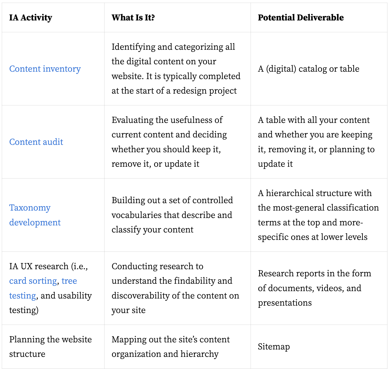
The process of creating the IA of an app or website is ongoing and should be tested with users and constantly enhanced, but it generally involves the following essential steps shown in the image below from the NNG website (full article is linked below).

# Mobile and Web Navigation systems
When designing for both mobile and web platforms, navigation systems must be tailored to the specific characteristics and constraints of each medium. Here are the key differences between mobile and web navigation:
# Screen Size and Real Estate
- Web: Larger screens provide more space for complex and detailed navigation structures, such as horizontal menus, dropdowns, and sidebars.
- Mobile: Smaller screens require more compact and simplified navigation. Designers often use icons, hidden menus (like hamburger menus), and bottom navigation bars to save space.
# Interaction Methods
- Web: Users interact primarily through clicks and hover states, which allow for multi-level dropdowns and tooltip enhancements.
- Mobile: Users interact via touch gestures (tapping, swiping, pinching), necessitating larger touch targets and more intuitive gestures. Hover states are not applicable.
# Navigation Placement
- Web: Navigation elements are typically placed at the top or sides of the page. Fixed (sticky) headers and sidebars are common for persistent navigation.
- Mobile: Navigation elements are often placed at the bottom of the screen (bottom navigation bars) or accessed through hidden menus (hamburger menus) to maximize screen space for content.

# Menu Design
- Web: Menus can be extensive, with dropdowns and submenus providing access to deep site hierarchies.
- Mobile: Menus need to be concise and easily accessible. Hamburger menus, sliding panels, and bottom navigation are common solutions to handle deeper navigation.
# User Behavior and Context
- Web: Users often have more time and a more relaxed environment to explore complex navigation structures. They may use keyboard shortcuts and tabs to navigate quickly.
- Mobile: Users are often on the go and need quick, direct access to information. Navigation must be streamlined to minimize the number of taps and ensure fast access to essential features.
# Performance and Loading
- Web: Higher bandwidth and more powerful processors mean that complex animations and transitions in navigation can be used without significant performance issues.
- Mobile: Limited bandwidth and processing power on mobile devices necessitate lightweight navigation solutions to ensure quick loading times and smooth performance.
# Content Prioritization
- Web: More screen space allows for displaying multiple navigation options and more detailed content simultaneously.
- Mobile: Limited screen space means prioritizing content. Designers must decide which elements are most important and ensure they are easily accessible.
# Responsive Design Considerations
- Web: Responsive design techniques ensure that navigation adjusts fluidly across different screen sizes, maintaining usability on desktops, tablets, and smaller screens.
- Mobile: Mobile-first design often leads to a more simplified, touch-friendly navigation system that can be adapted for larger screens if necessary.
# Examples of Navigation Patterns
# Web Navigation Patterns
- Mega Menus: Large, multi-column dropdowns that reveal extensive navigation options.
- Breadcrumbs: A trail showing the user's current location within the site hierarchy.
- Sidebars: Vertical menus providing access to various sections of a site, often used in conjunction with top navigation.
# Mobile Navigation Patterns
- Hamburger Menus: Three-line icons that, when tapped, reveal hidden navigation options.
- Bottom Navigation: A bar at the bottom of the screen providing quick access to primary sections of an app.
- Tab Bars: Horizontal navigation bars typically placed at the bottom, allowing quick switching between core app sections.
# Conclusion
Understanding these differences is crucial for creating effective navigation systems that provide a seamless user experience across both mobile and web platforms. Designers must consider the unique constraints and user behaviors associated with each medium to optimize navigation and ensure users can easily find and interact with the content they need.
# Read
- The Comprehensive Guide to Information Architecture (opens new window)
- An Excellent Beginner’s Guide to Information Architecture (opens new window)
- Information Architecture vs. Sitemaps: What’s the Difference? (opens new window)
- Mobile navigation: patterns and examples (opens new window)